WHAT SONGS MAKE THE PERFECT SETLIST?
[This post is courtesy of Ryan Smith, dot net user @ryansmith534, a data scientist formerly at Spotify.Thank you, Ryan! -Ed.]
Every Phish fan undoubtedly has their own answer to this question – but is there a universal truth across all fans? Using setlist data and user ratings from Phish.net, we can attempt to answer this question empirically.
To do this, we can borrow methodology from basketball and hockey analytics, specifically the concept of RAPM (regularized adjusted plus-minus). This metric attempts to quantify an answer to the question: how much does the presence of a given player on the court contribute to a team’s point differential? In our case, the question becomes: how much does the presence of a given song in a setlist contribute to a show’s rating on Phish.net?
We first need to gather the necessary data, a process made significantly easier because of the convenience of the Phish.net API. After doing a bunch of cleaning and manipulation, we get a dataset that looks like this:
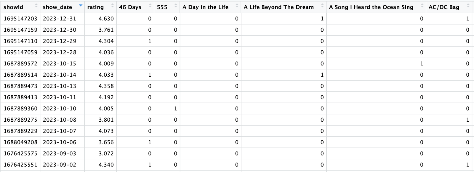
We have one row for every show, a column with the show’s rating, and a column for every song in Phish’s repertoire – with a 0 or 1 value representing whether the song was played at a given show.
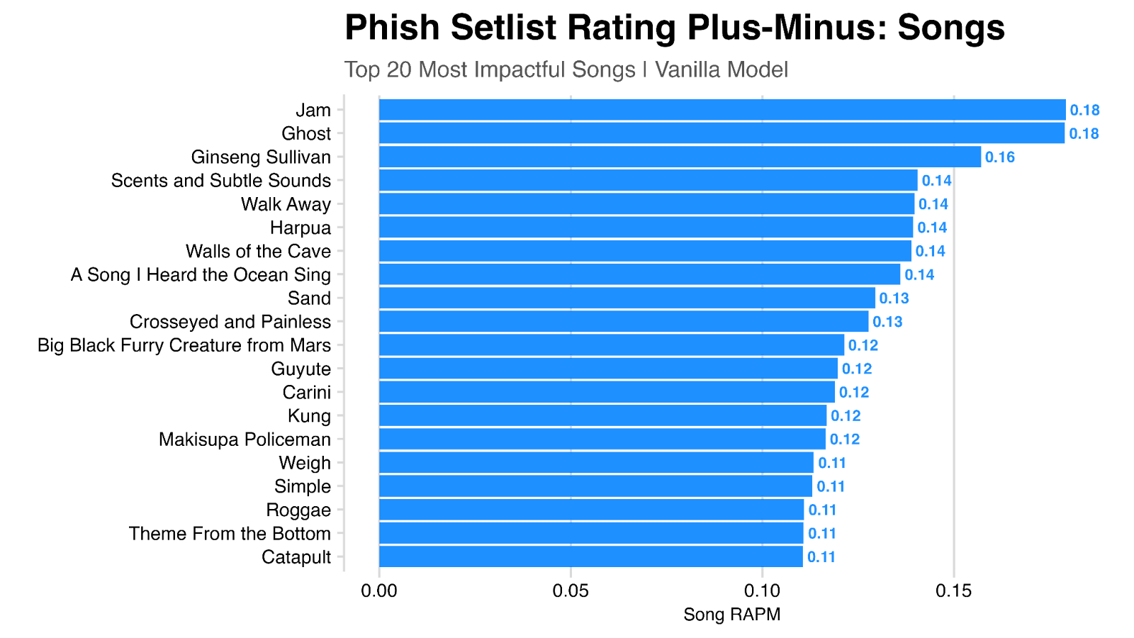
We can then fit a model to this data to understand how the presence of a given show impacts user ratings. We’ll use a ridge regression, which is a model well-suited to deal with the problem of multicollinearity – which in our case is the problem of certain songs being played together frequently (think Mike’s Song and Weekapaug Groove), which makes teasing out the impact of each individually somewhat difficult with more basic models.
The output of the model looks something like this, with each song having a value (‘coefficient’) that represents the expected contribution of that song to a show’s rating. For example, we see Ghost is the top rated song, with an expected rating contribution of ~0.18 (the presence of a jam is also worth 0.18). Another way to interpret this – if you took an “neutral” setlist (roughly 3.29) and added Ghost to the setlist, we would expect that show rating to increase to 3.47.
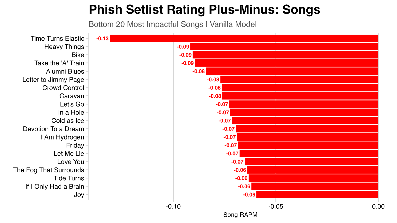
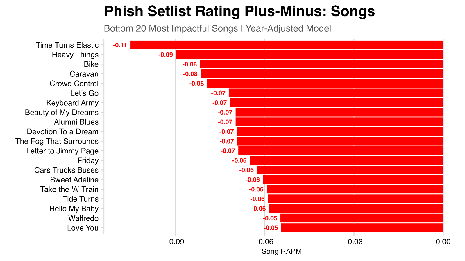
Looking at the songs with the strongest negative contribution to shows ratings, we see Time Turns Elastic rating last, with a contribution of -0.13.
But perhaps this isn’t the full story! For example, what if a song just happened to be played a lot during periods where the band was playing their best (and thus where shows were highly rated)? Put another way, it’s not the presence of the song in a setlist that contributed to a high rating in these cases, rather that the band just sounded great at the time. We can help account for this by adding information about the year or tour to the model.
Re-running the model, now controlling for year, we can again look at the top songs. The results are largely the same, but we do see some difference. For example, My Soul falls from 0.07 to 0.03 in this model, largely because it was most played frequently in 1997 and 1998 when the band was at their best.
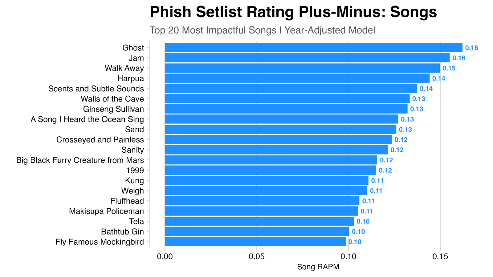
Looking at the bottom-ranked songs, we see that AC/DC Bag is no longer towards the very bottom (going from -0.06 to -0.03), in large part because it was frequently played from 1988-1990 where shows tended to be lower rated, which this model now takes into account.
By adding ‘year’ as a feature to the model, we can also look at the impact that each year has on user ratings (independent of the impact from the quality of the setlists). Here we see 1997, 1998, and 2017 as the three “best” years, all with a contribution of 0.17.

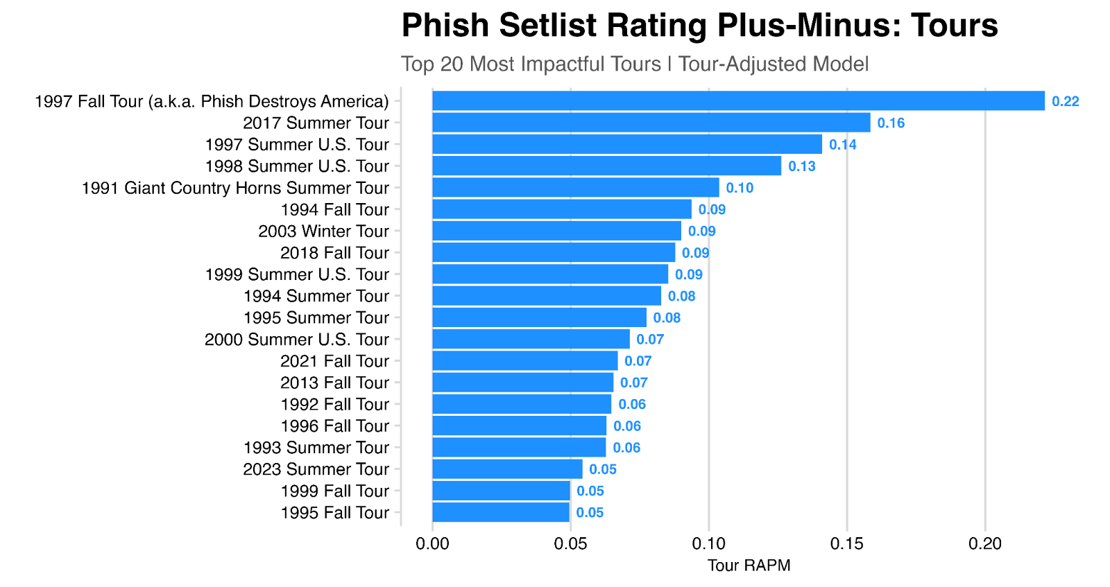
We can perform the same exercise with specific tours, rather than years – here we see the 1997 Fall Tour as far and away the most impactful single tour, with a contribution of 0.22.
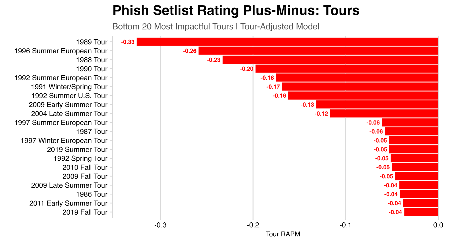
And here looking at the bottom-ranked tours:
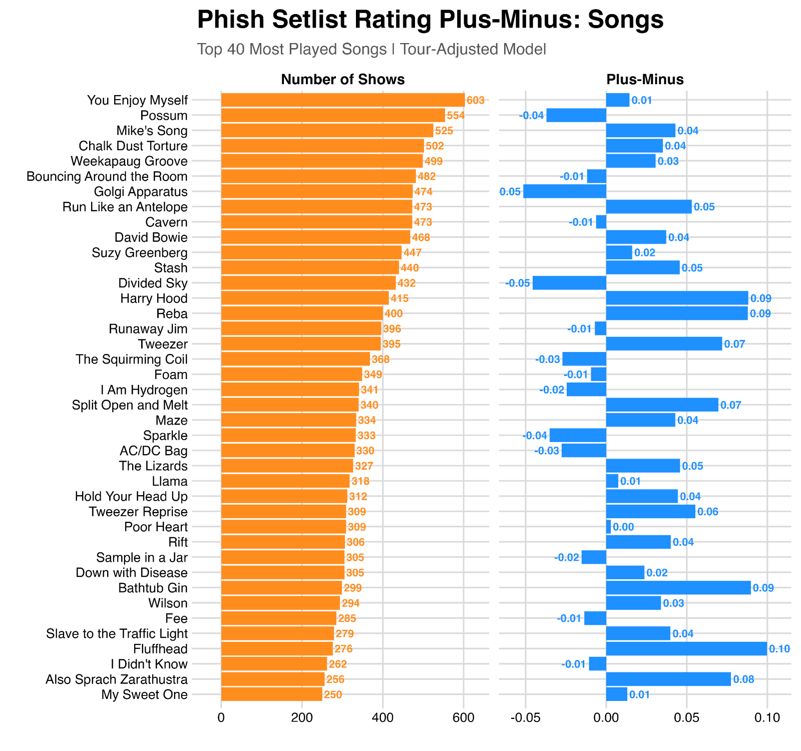
Here’s a look at the plus-minus rating for the 40 most-played shows since 1984, using this model:
Is all this modeling worth the effort? Why not just look at the average rating for shows where a given song is played? We do indeed see these two things are correlated (r-squared = ~0.4), but there are plenty of edge cases.
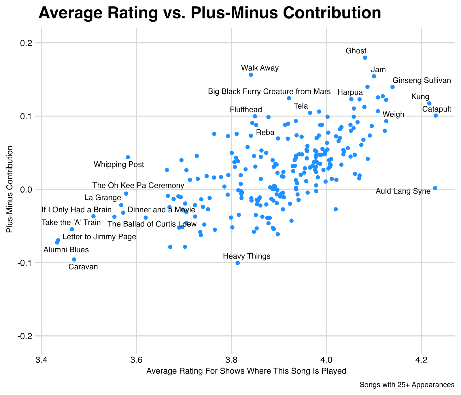
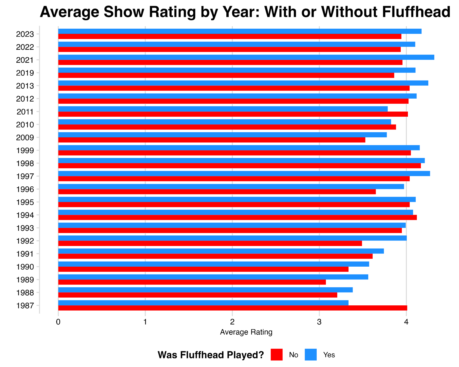
For example, shows where Fluffhead is played hold an average rating of 3.85, which is in the bottom 30% of all shows – largely because the song was played so frequently during the late 1980s where average ratings are low. But the plus-minus impact Fluffhead has is roughly 0.10, which is in the top 10% of all songs. Going back to our basketball analogy, Fluffhead has a low average rating because it “tended to play on bad teams”, but we can consider Fluffhead to be an “elite player” because of its estimated impact – in other words, these shows would have rated even worse without Fluffhead, and indeed we can see on a year-by-year basis, shows with Fluffhead tend to rate higher than shows without Fluffhead (“on the court vs. off the court”).
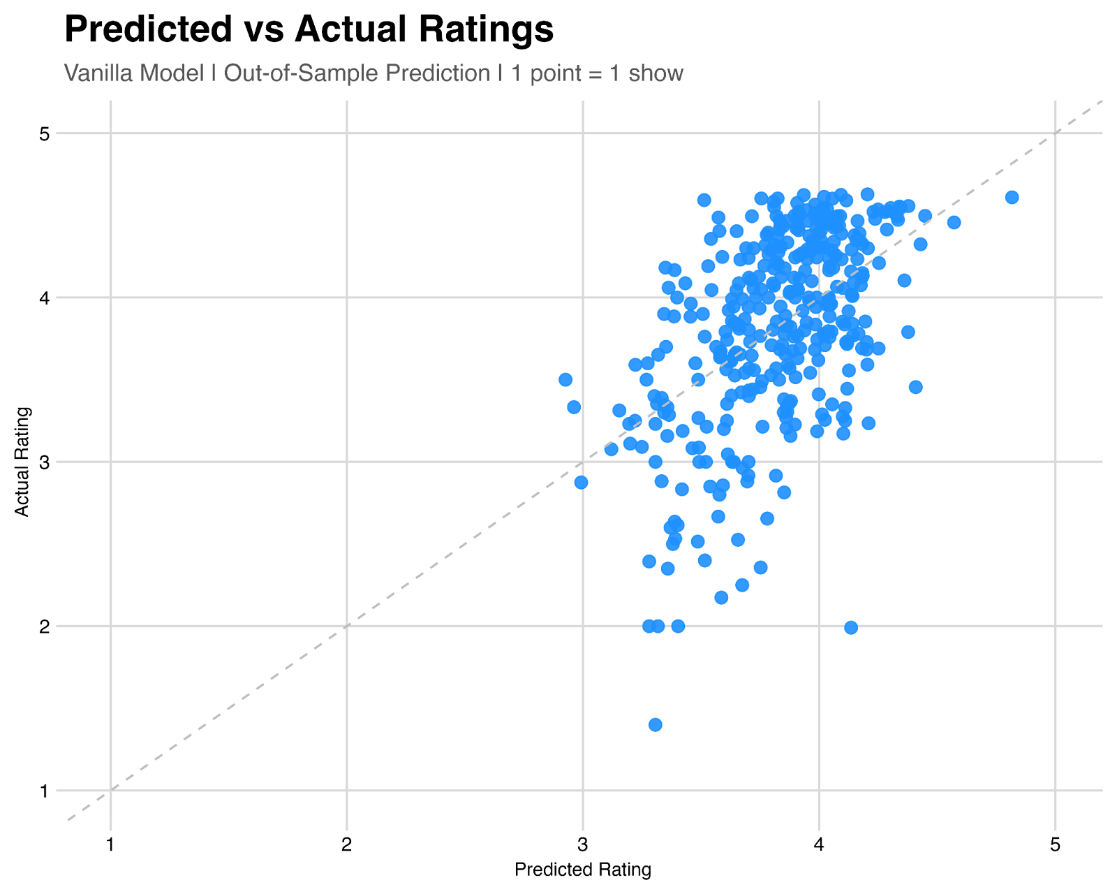
Finally, how do we know if this model is any good? When we say Ghost is the most impactful song, how do we know whether that’s accurate? We can test this by training a model on a subset of our data, and trying to predict the rating of some shows we set aside.
As visualized below, the vanilla model (trained without year or tour information) is moderately predictive of user ratings, with an r-squared 0.28 – meaning about 28% of the variance in user ratings from show-to-show can be explained solely by the songs that appear on the setlist.
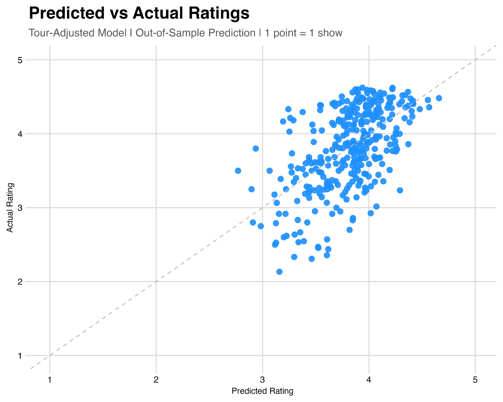
When we conduct the same exercise with tour information encoded in the model, we see a modest bump in predictiveness, with r-squared going up to 0.36 – meaning about 36% of the variance in user ratings from show-to-show can be explained by the tour a show was a part of, as well as the songs that appear on the setlist.
That’s still a lot of unexplained variance! Which, to me, speaks to the beauty of this band. No matter how a tour has been going, and no matter what songs are set to be played on a given night, there’s always a chance you can have your mind blown.
To see ratings for all songs, please check out this spreadsheet.
Comments
You must be logged in to post a comment.
 The Mockingbird Foundation
I'm surprised that Hydrogen doesn't fare better, but I guess H contributes little above and beyond Mike's and Weekapaug.
or maybe we have evidence that (Mike's groove with H) < (Mike's groove with something other than H)
I'm curious what a 4.0-only analysis looks like -- it would remove songs from years ago that are rarities or outright shelved, bring in newer material, and better reflect their current songbook (acknowledging that it's always a moving target, with new material in 2023 and TAB tour hinting more to come this summer).
From a forward-looking perspective, it would be interesting to get a plus/minus for that period and see how predictive it is for the rest of 2024.
So very well done!
I will say that TTE gets a bum rap. It is written like a mathematic formula, and there was a time when I would crank the studio versions after years of being starved. It’s like Petrichor - it shouldn’t be jammed, just played. Sparingly.
I’ll tell you what’s bad - seeing 50th shows and estimating a combination of Mike’s Groove/Possum at half. Love em all, but don’t need to hear another live version of any of them.
This is amazing. Similar idea to Song Batting Average Thread ... but much more advanced.
Definitely in the running for plenary session at next year's Phish Studies Conference in Oregon!